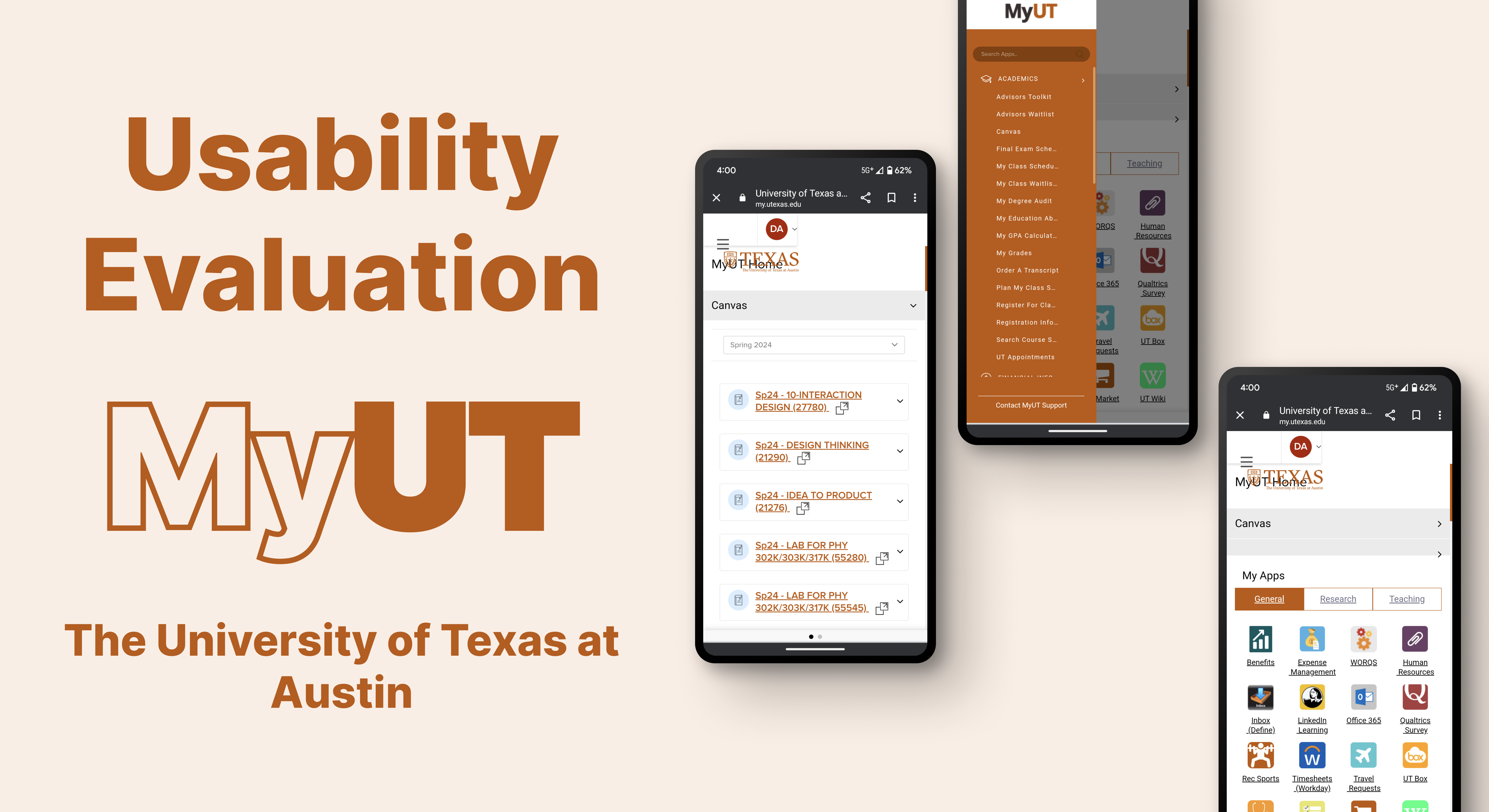
MyUT is the University of Texas main page of information for all students regarding any questions they may have. It is a one-stop shop for all students' needs.
Project Scope
- Client: MyUT
- Time Frame: 5 Monts
- My Role: UX Researcher
- Team: Deep, Jenny, Melissa, WanTing-Wang
- Methods: Competetive Analysis, Heuristic Evaluation, Participant Interviews, Screener
- Tools: Figma, FigJam
Client Kickoff
UT envisions MyUT as a comprehensive student hub, but current usage suggests otherwise. To bridge the gap, we're analyzing mobile MyUT, uncovering usage patterns and identifying improvement areas. By understanding student needs, we'll develop actionable recommendations, transforming MyUT into the essential resource it was designed to be.
Objectives
Our mission is to elevate MyUT to its full potential as the central hub for the student community. Armed with valuable insights, we aim to formulate actionable recommendations for user experience improvements. These recommendations will drive MyUT towards fulfilling its intended role as a seamless and essential resource for all students.
Notes
Target Audience
Primary: Any undergraduate student
Secondary: Other Non-UG UT students

Heuristic Evaluation
User Control & Freedom

Violation
- When clicking the hamburger menu, there is no button to go back to the main page.
- The user is not offered an easily accessible or visible form of exiting the page hence limiting the users freedom to escape the situation.
Recommendations
- There should be a return button to take the user back. Which could be an (x) or a (<--)preferably in the top right corner.
Violation
- There are two horizontal scrolls in a single page.
- I tried to scroll horizontally then both the navbar and the page both scrolled at the same time. I was having difficulty scrolling.
Recommendation
- There should an arrow on both sides of the link bar which will differentiate both the scrolls.
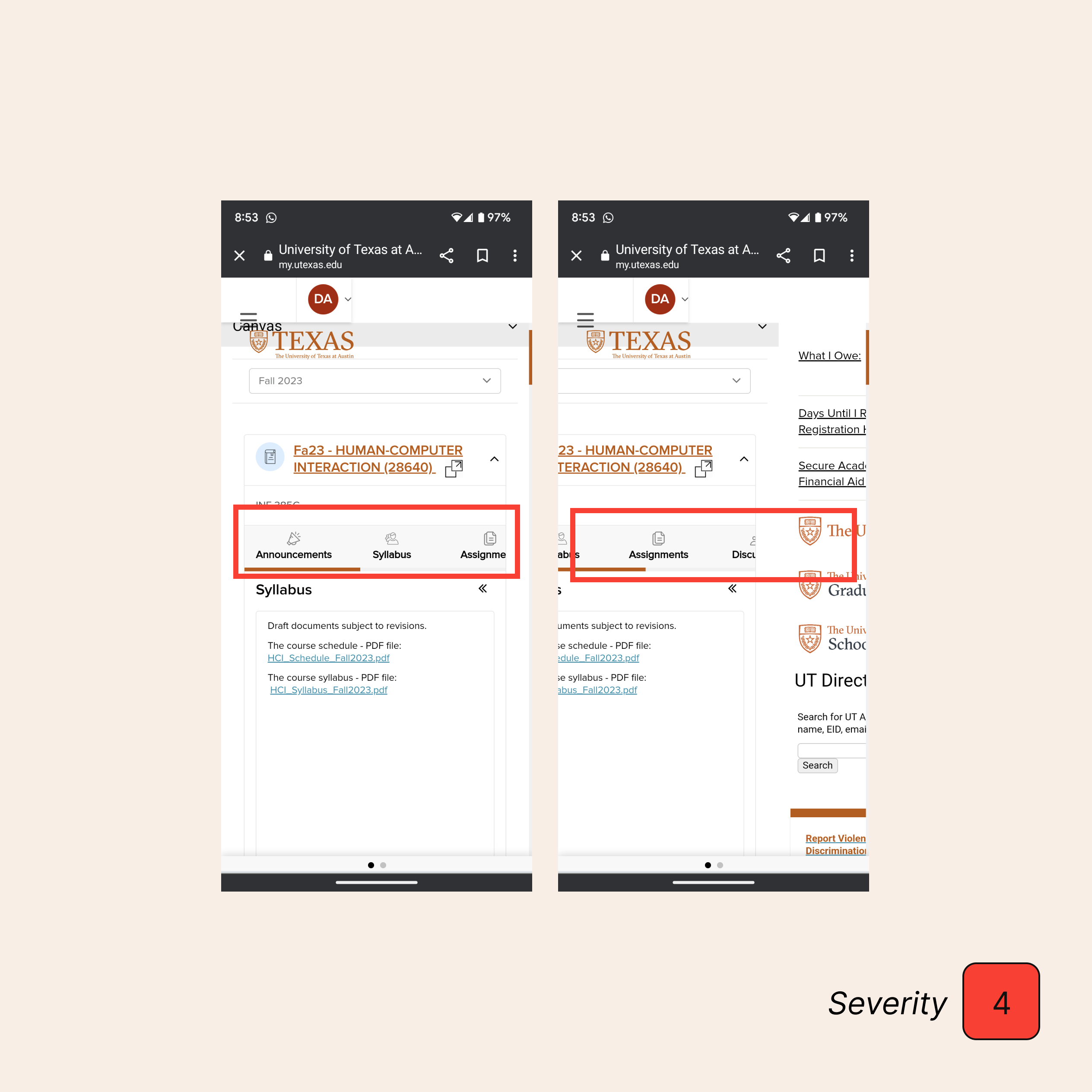
Consistency & Standard
Violation
- The icon displayed in the top right corner is unrecognizable to first-time users and difficult for users to know about the function since the color and placement is not effective for user to locate.
- The icon bar is also missing from the mobile version, and the lack of consistency makes it easy for users to get confused.
Recommendations
- Recommend adding labels to each icon to help users identify its function. The size and color would need be changed so that users could see them at a glance, and the weight of the icon should be equal.
- The school logo can go all the way to the right and the icons can go to the left of the logo. The icon should be constant in placement for both desktop and mobile version so the users would not be confused.

Violation
- Clicking the infographics, the top one does not have a link to external pages, while the others do. However, the links are not functional.
Recommendations
- Either delete these unfunctional infographics, where users may perceive them as an interactive response by clicking the icon, or present users with the icon that informs them they are going to an external link, like the one shown next to “Grad Student Mentoring -Students”.
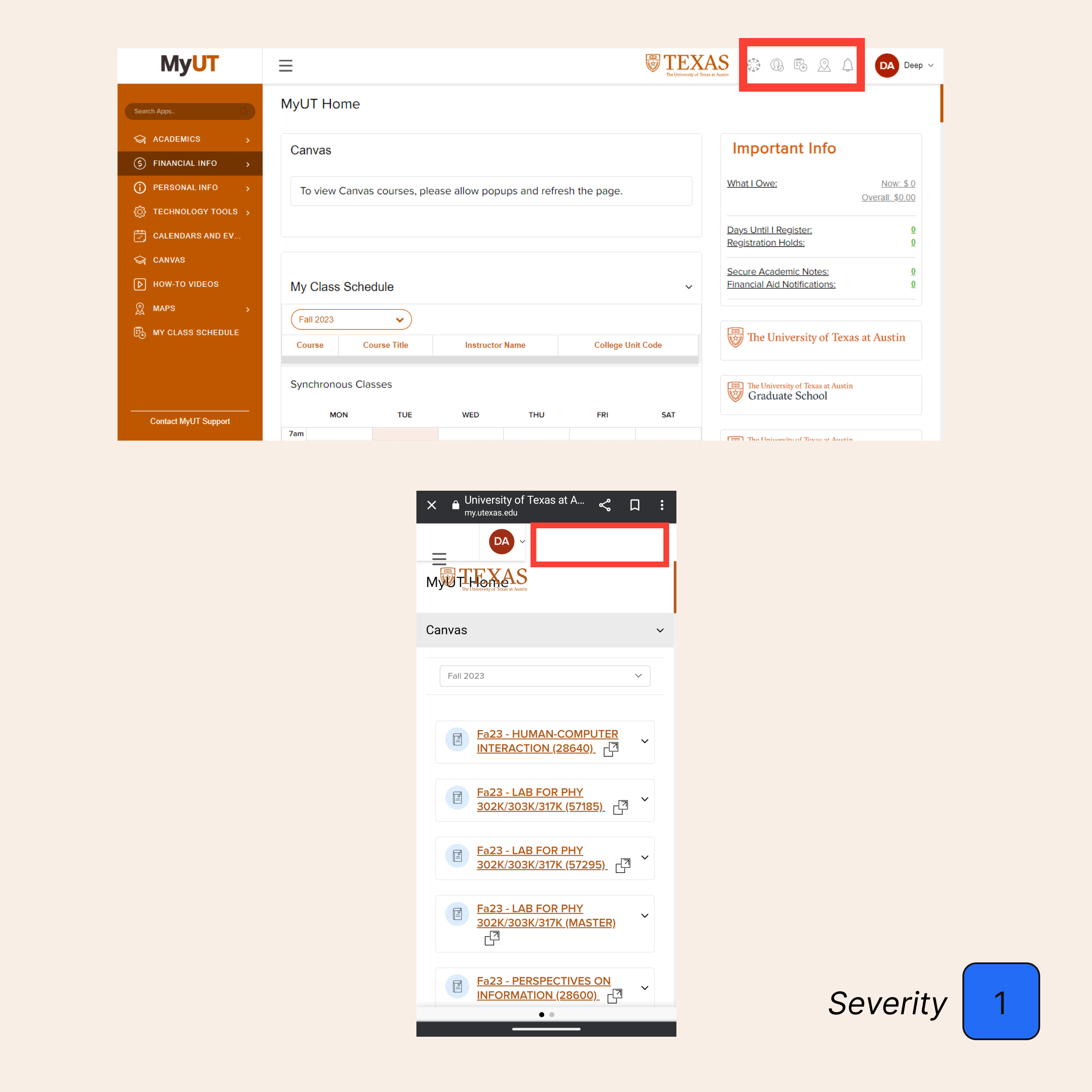
Flexibility & Efficiency of Use

Violation
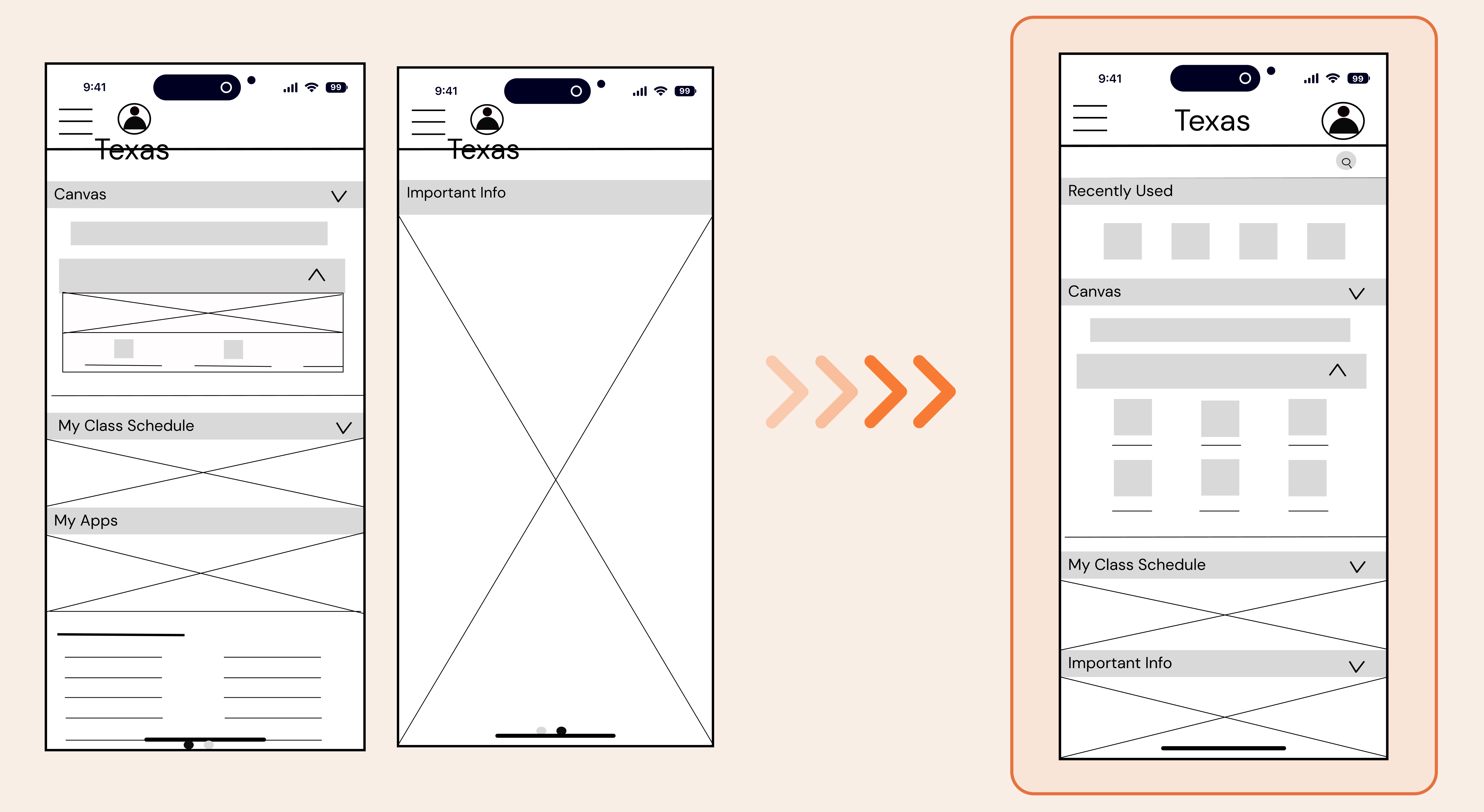
- When the user goes on the mobile version of the website they are only presented with half of the website and are unaware of the second half.
- The other half of the website is hidden from view and can only be accessed by 2 light grey dots on the bottom of the page that blends in with the bottom tab. This causes confusion for the user as they are unaware of the “hidden page”.
- This makes the mobile version hard to use and ineffective. As an advanced user recognize the dots mean there is more to website that I am seeing.
- However for others this may not be the same and they may need amore obvious design.
Recommendations
- Recommendation would be to replace the light grey dots with a larger bright orange toggle. To make it more obvious to users at first glance.
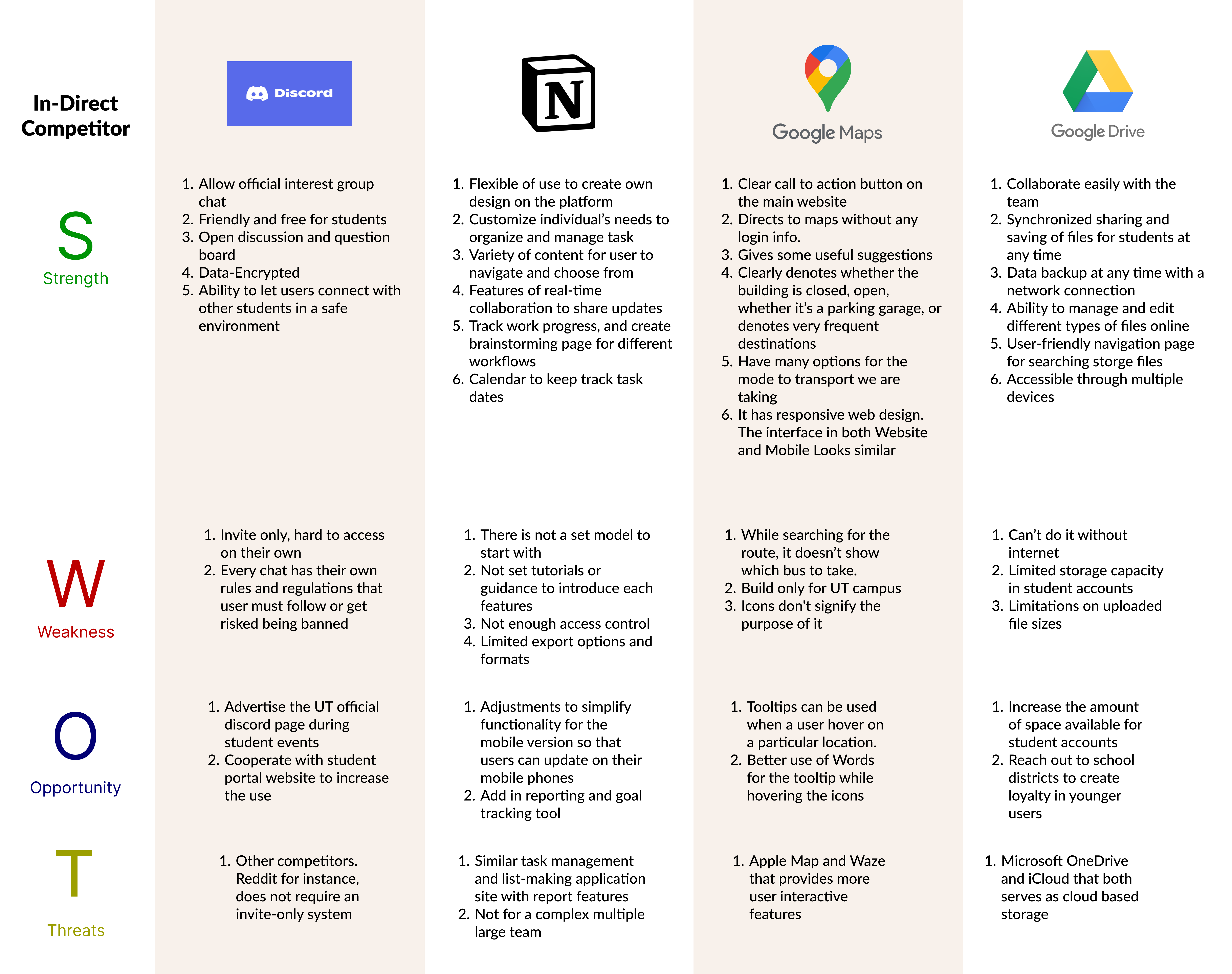
Competetive Analysis

Research Desgin
Participants

Screener
Recruitment
With the use of our screener we recruited those that met our qualifications that include:
- University of Texas at Austin student
- Gender: Mix
- Age: Range of age (18-32)
- Range in experience of using MyUT
- Agreement to sign NDA and be recorded
Terminated
For those that did not meet the screening requirements we still decided to include their inputs with separate questions. We gained various insights from this group such as:
- What other sites they use to access information regarding school and why?
- What they believe MyUT is missing?
- What can be added to MyUT to enhance user loyalty and satisfaction?
- The reason they do not use MyUT.
Task Analysis
Task 1: Scenario
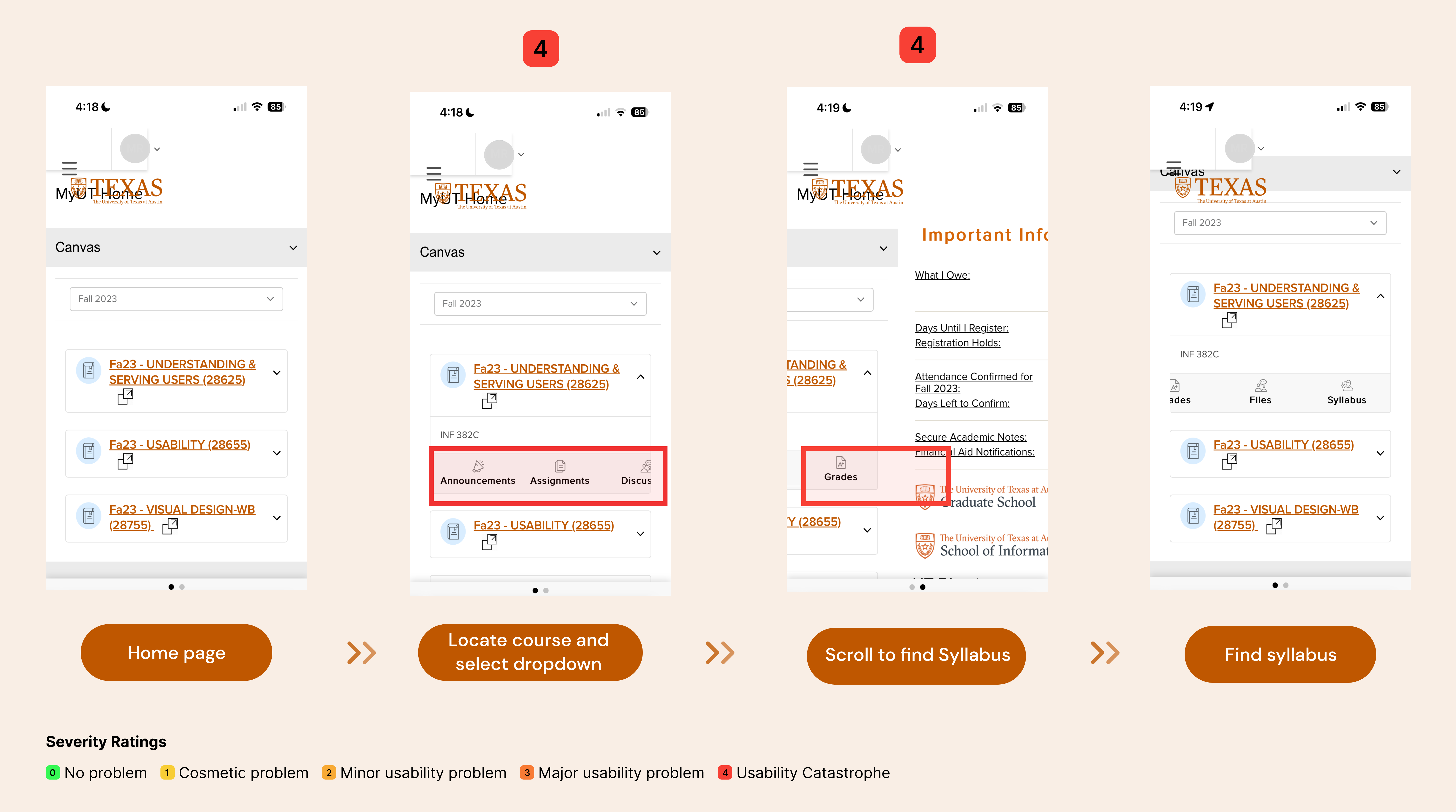
Using MyUT homepage find your first course that shows up on the homepage. Can you find your syllabus for that first course without leaving the page?
Observations
- Some users were unaware that there is a horizontal scroll.
- Conflicting layouts depending on participants updated IOS.
- Users thought system was glitching or perceived it as user error.
- The horizontal screen bar conflicts with accessing the secondary page.
Recommendations
- Vertical dropdowns menu would be efficient as its best to design with a vertical screen in mind.
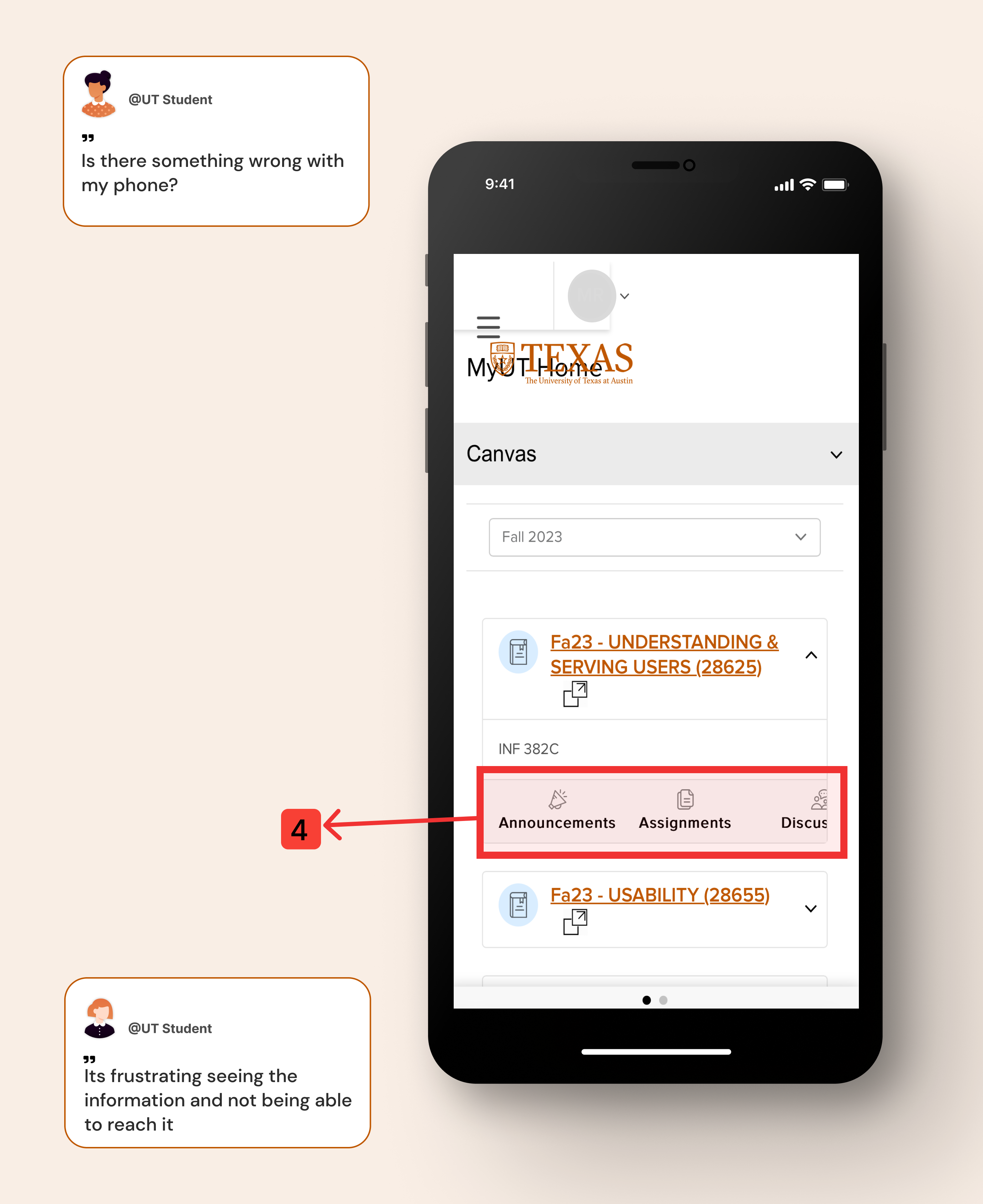

Task 2: Scenario
Please open up MyUT on your phone’s website page. Locate the hamburger drop down menu. Now can you exit out?

Observations
- Some users have issue viewing the hamburger icon among clutter.
- Most users take a while to realize their is no exit button, but quickly recover and tap out of frame to exit.
Recommendations
- Clear the cluttered area so that the hamburger is easily accessible.
- The hamburger menu should have a clear exit labeled such as an (X) on the top right.

Task 3: Scenario
Please open up MyUT on the phone’s website page. Can you check to see if you have any registration holds without leaving the home page or going to an external link?
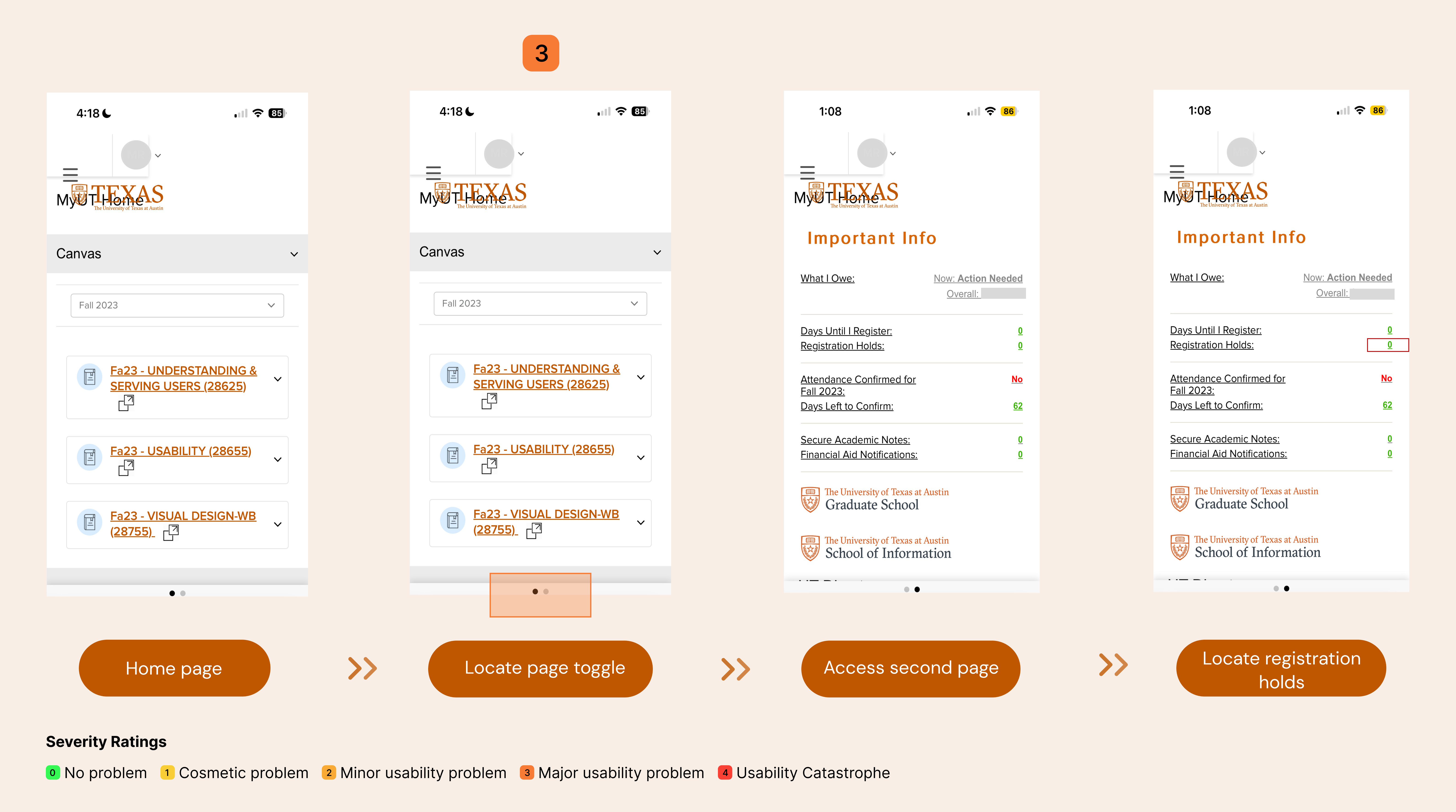
Observations
- The toggle option was not obvious enough to alert users of the second page on the website.
- Many users who know where it is on desktop assumed the information would be further down since its a vertical screen.
Recommendations
- Remove “second page” on mobile screen as vertical screen must be taken into consideration in design, hence all its components should be vertical.
- If second page is to remain then there must be a more obvious form of toggle to alert user.

Task 4: Scenario
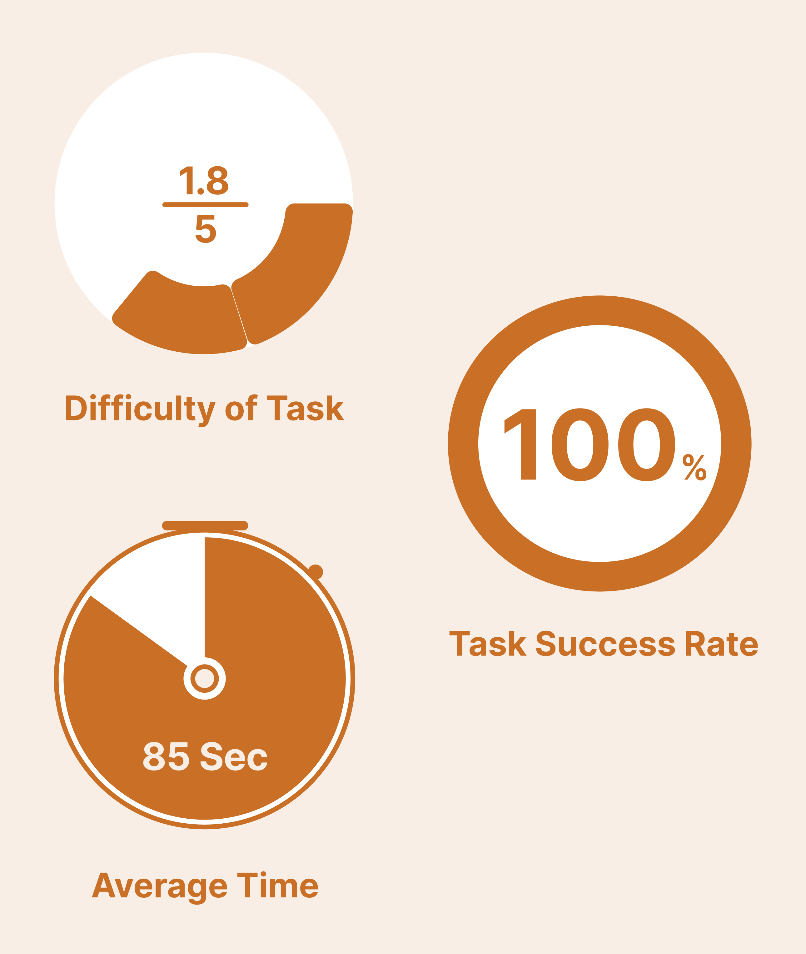
Using the MyUT website, on the homepage go to your class schedule and find your first courses’ building name. Next can you locate the street number of your first class from the MyUT website?
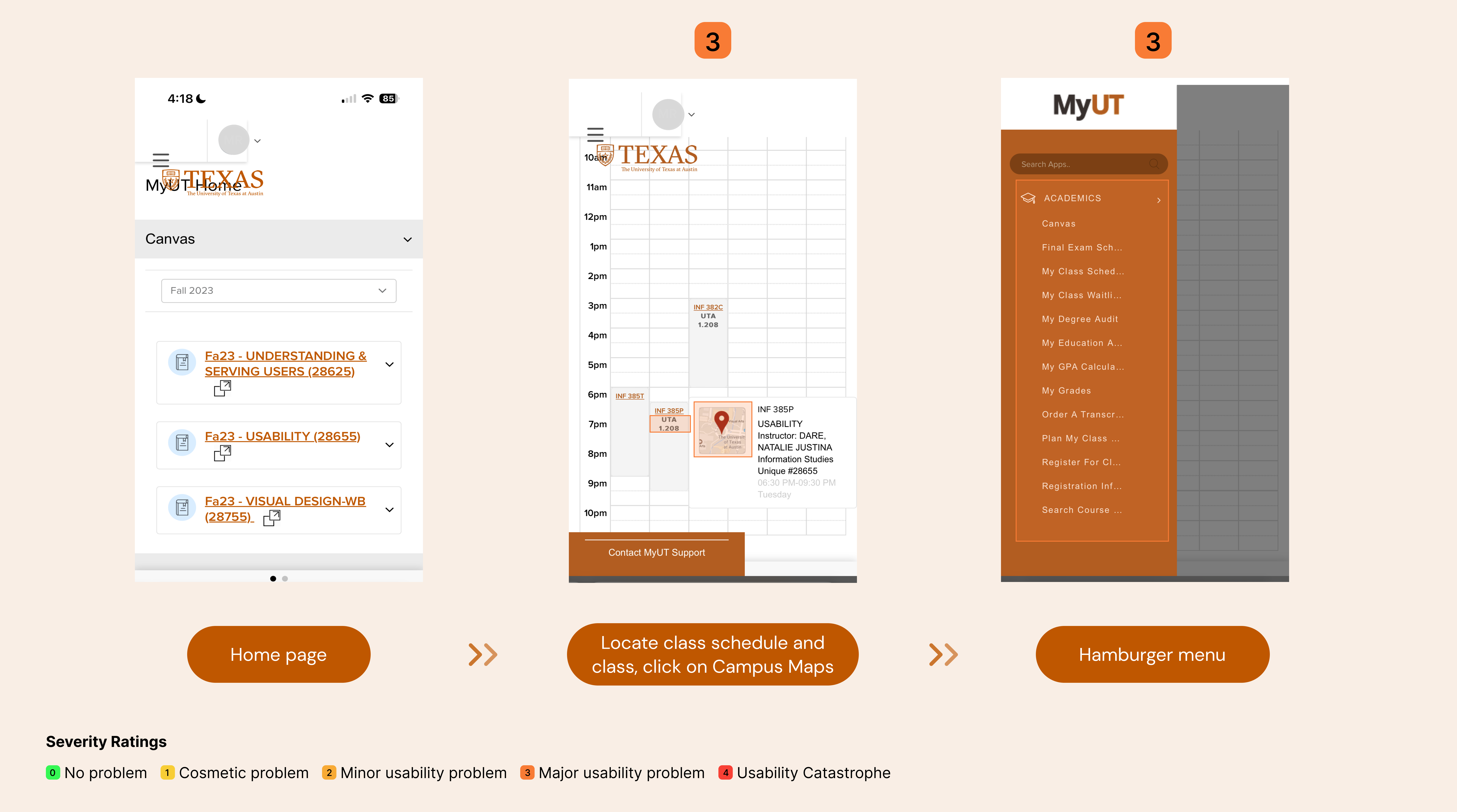

Observations
- The expanded version confuses the users as they believe there is nothing after the “ACADEMICS” portion.
- Users expressed annoyance having to scroll all the links of all the expanded categories under hamburger menu.
- Campus maps was all the way at the bottom and user was forced to scroll.
Recommendations
- The options inside the Hamburger menu should be condensed and not expanded.
- They should only be expanded once the user clicks on it.


Task 5: Scenario
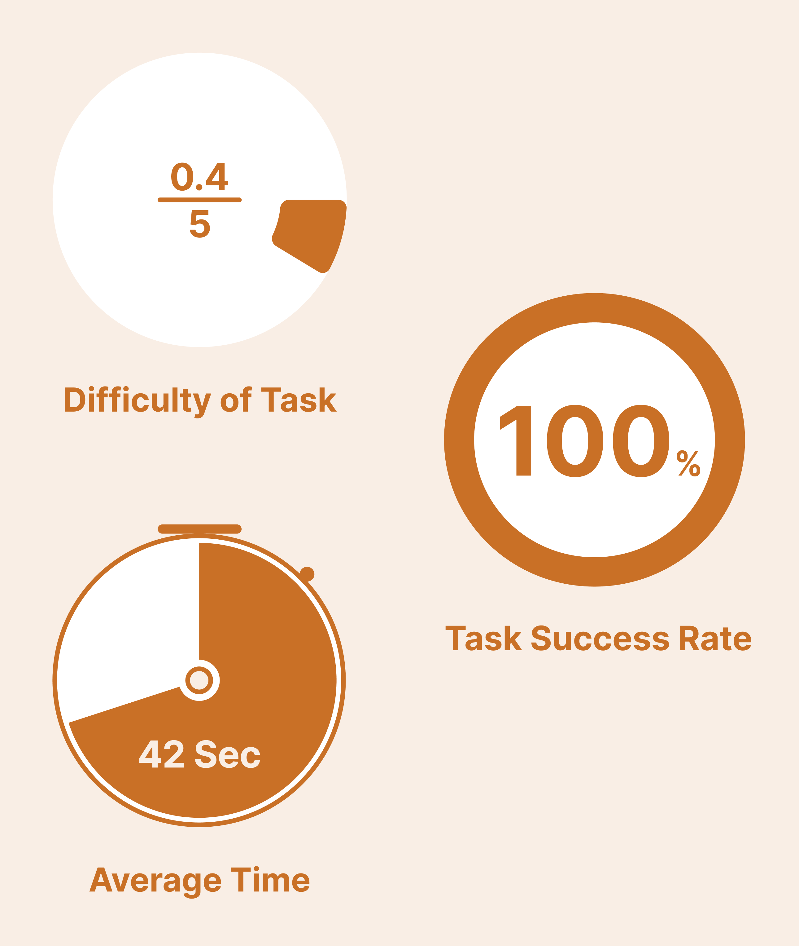
Find MyUHS (University Health Service) to check your Profile from the hamburger menu.
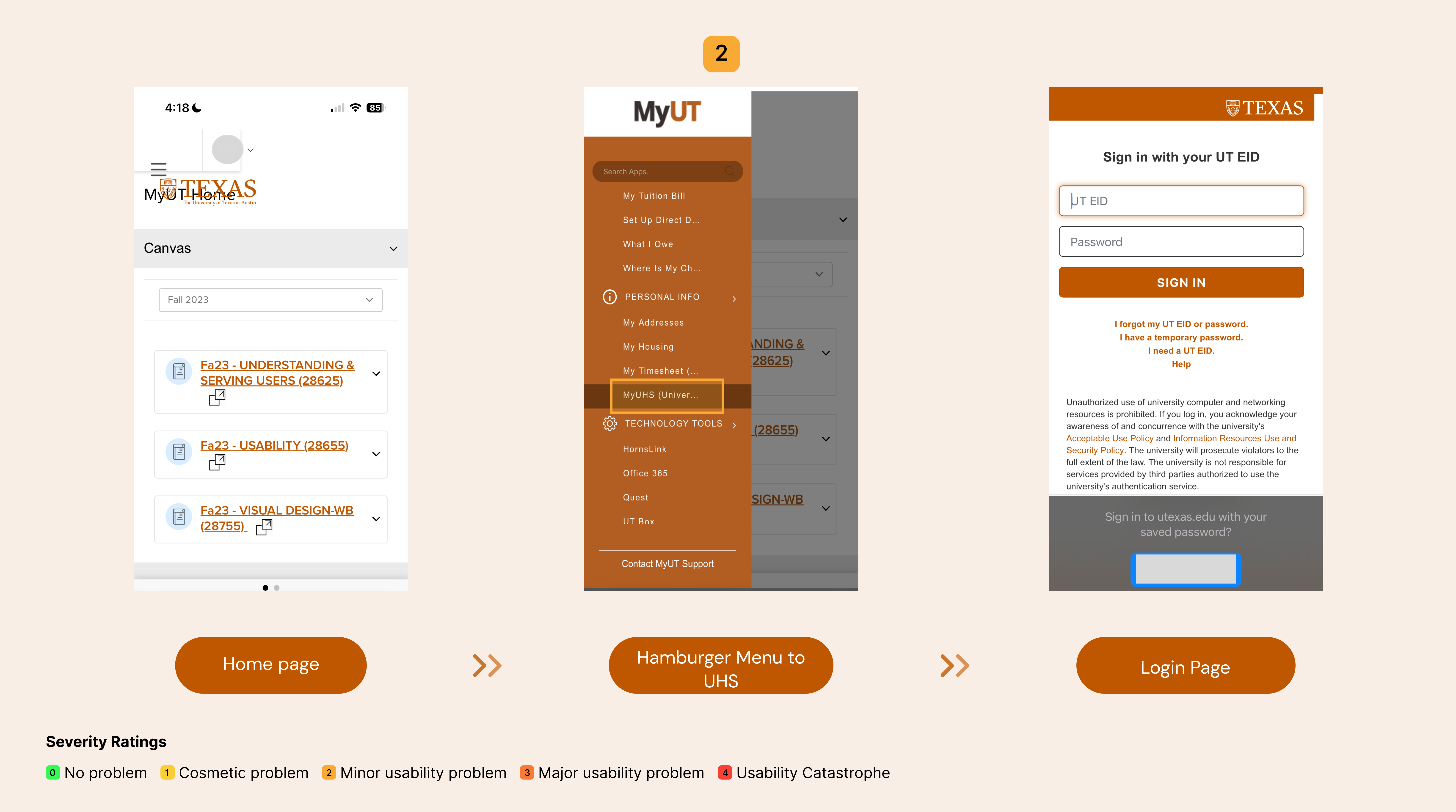

Observations
- Most users were confused about the re-login option. They assumed they either logged out or never logged in.
Recommendations
- Users on the MyUT site should be required to log in only once initially, and this login should persist throughout their entire session on the site.

Task 6: Scenario
Please go to MyUT on your phone’s website. Let's say you lost your ID and need to request another one. Using the homepage of MyUT go to the ID center to request an ID.


Observations
- All users needed the hint to be able to complete their task.
- After clicking the first link user gets confused as the page does not work and there is no re-direction.
- User is hesitant to click second link as if its exactly the same as the first.
- Still confusion as page is redirected to “New Service Portal”.
Recommendations
- There should be only 1 link instead of multiple links. As well as have the working link be set in only under 1 category to avoid link farm.
- The redirecting page should also be removed as most users expressed confusion.


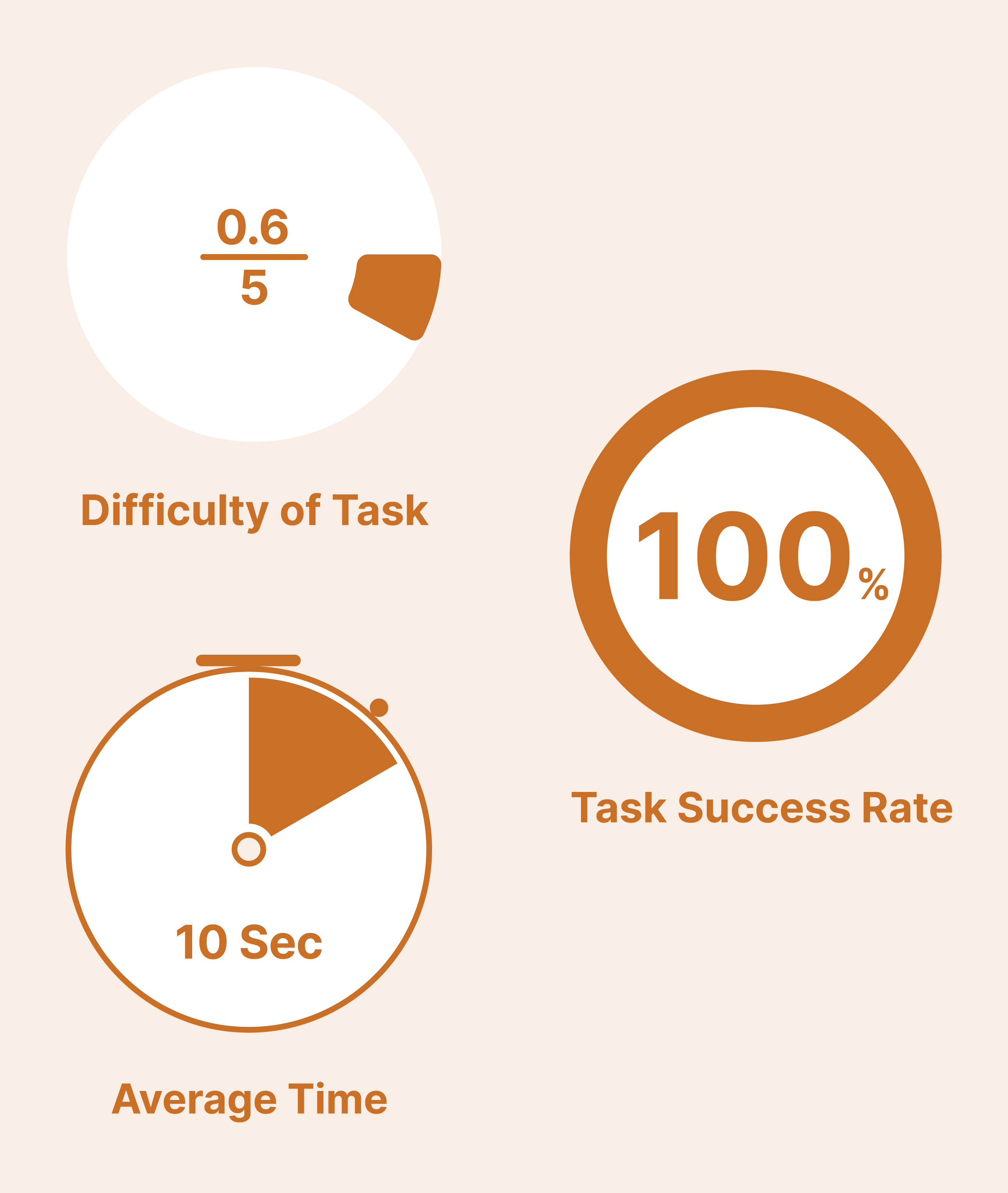
Result Analysis
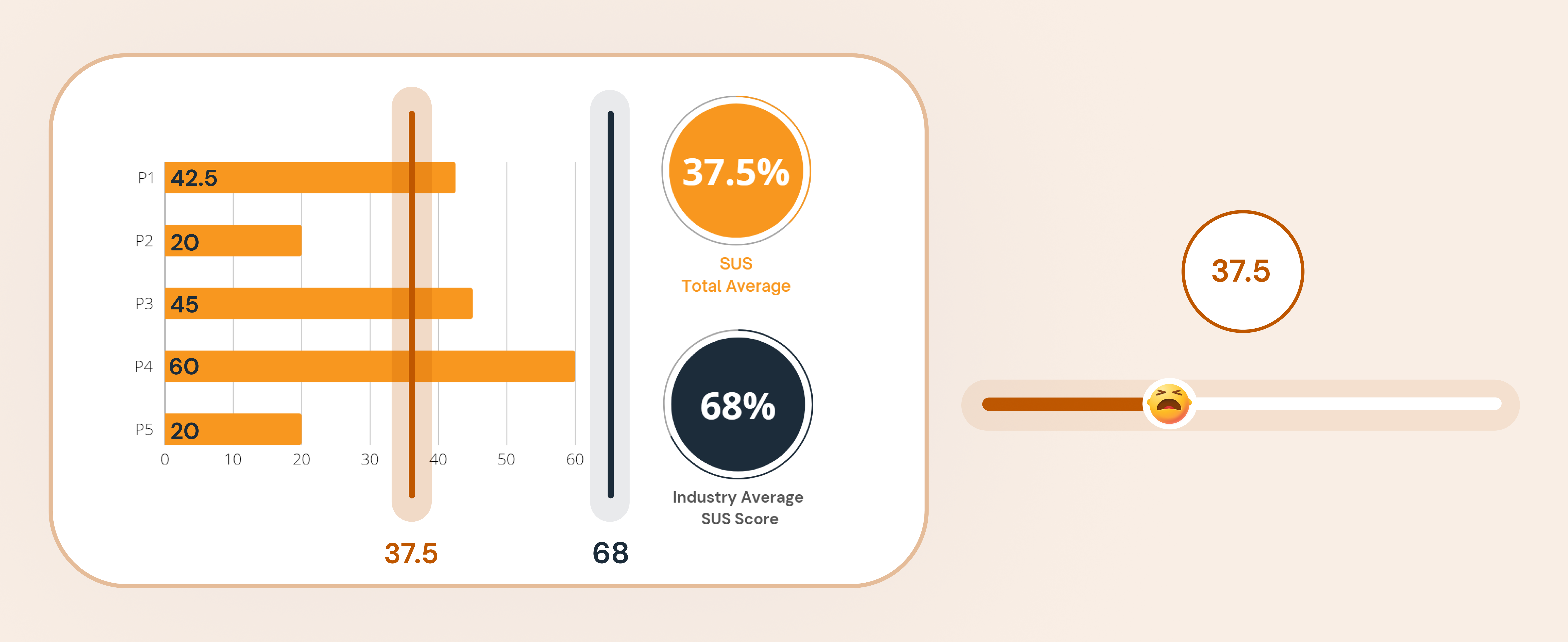
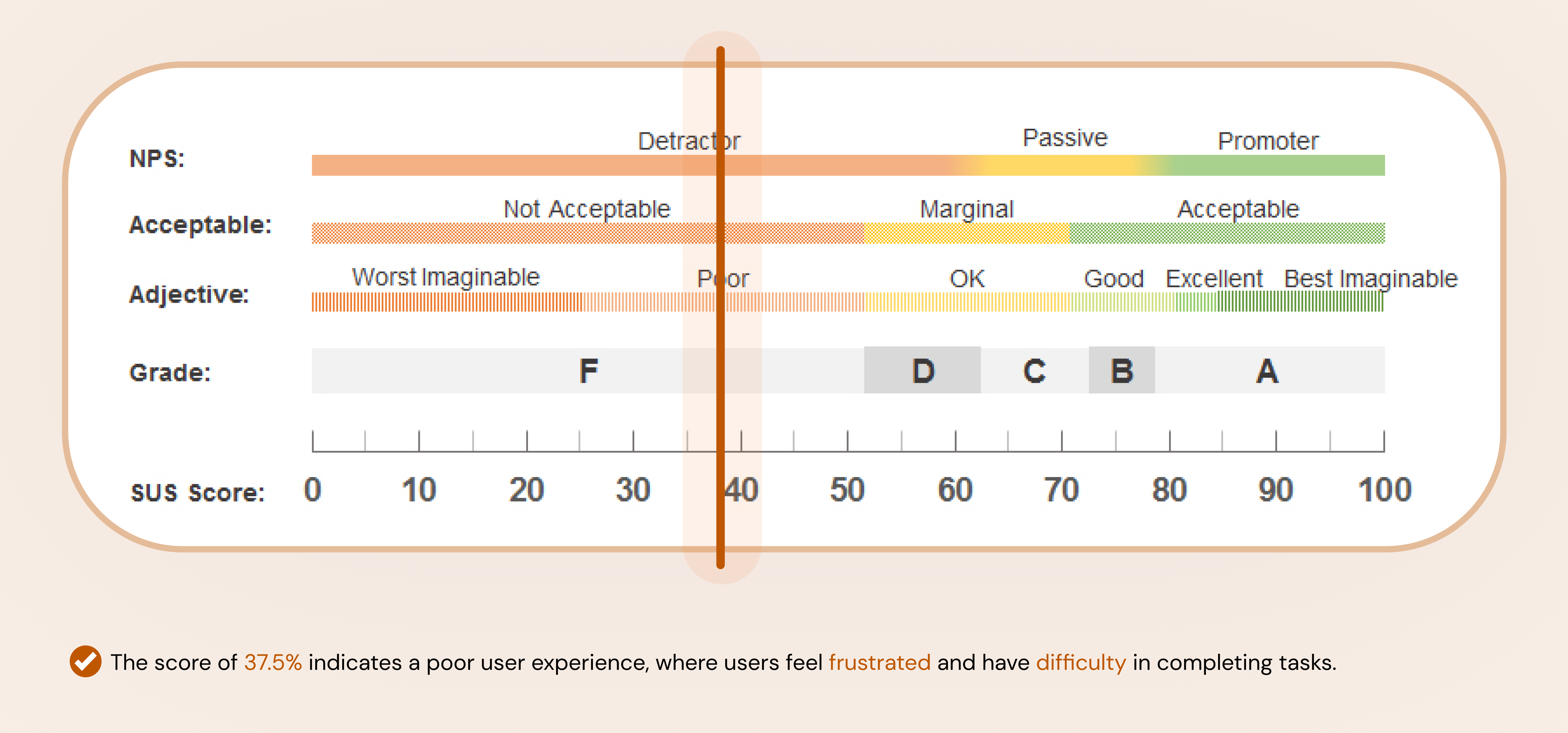
Participants' scores ranged from a low of 20 to a high of 60, indicating that participants were less likely to recommend the site to others. After comparison, none of the participants scored higher than the average SUS score of 68.
Additional Recommendations
Condensed Text
Most participants mentioned that the texts are too cluttered which makes it hard to search for the things they need. Two out of five participants said that they would rather “Google it”. Therefore, we recommend to condense the context and make texts easy to read by:
- Prioritizing the most important functions students need and delete repeated and dead links to avoid overcrowding.
- Adding icons, quick search and user history to easily navigate through the home page.

Hamburger Menu
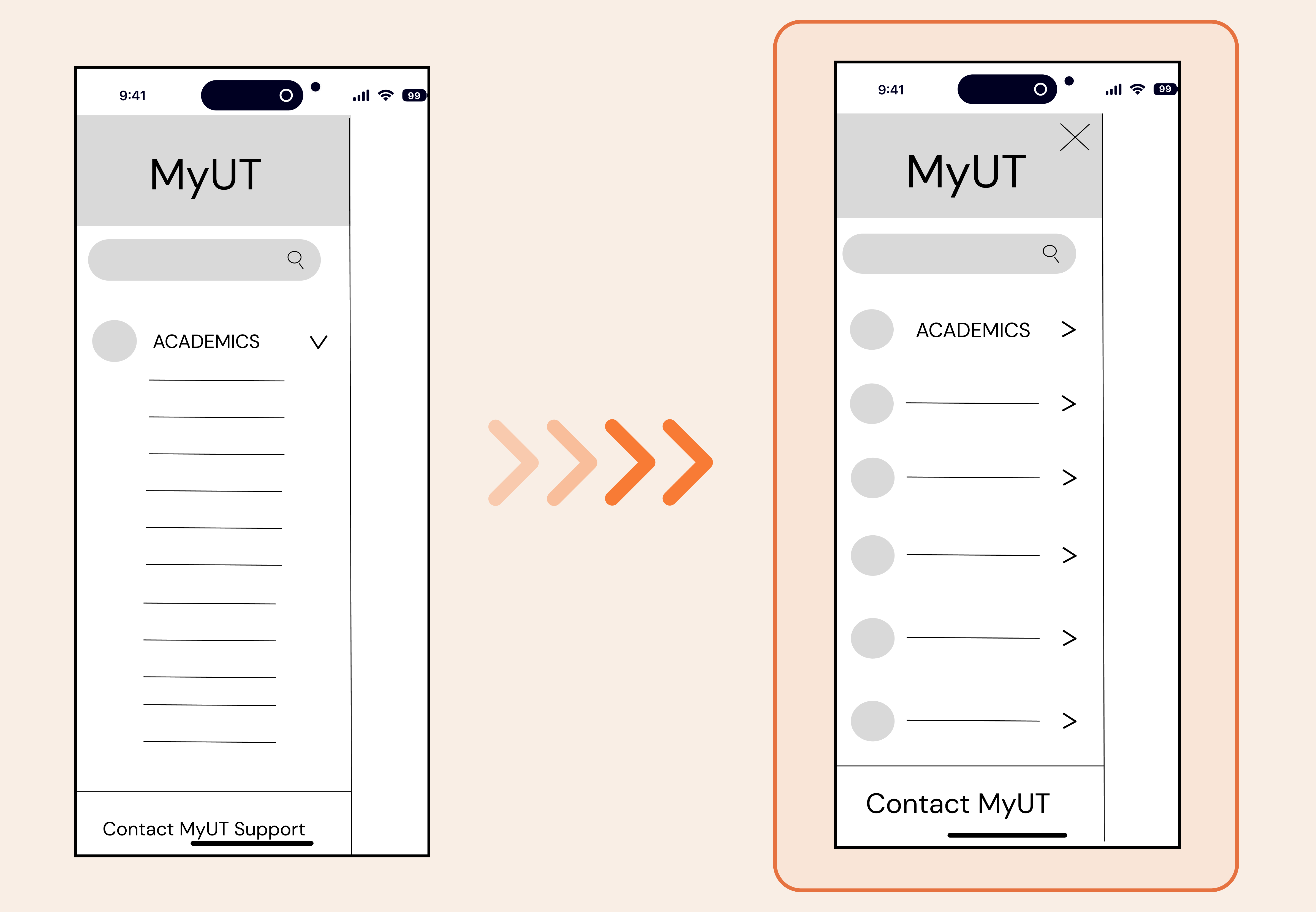
All participants required hints to navigate to the UT Map due to the unclear design, leading to an unawareness of additional functions in the hamburger menu. Most participants believe there is nothing after “Academics” as it cuts off. The redesign should include a way to let users know there is more to the hamburger menu.
- Concealing detailed information within expandable tabs to enhance clarity and organization.
- Add a close button in hamburger menu to align with user control and freedom, and to structure the navigation more intuitively.

Avoid horizontal scrolling in mobile version
Many users encounter challenges when switching between a horizontal navigation bar, finding it counter intuitive. We can address this issue by:
- Creating drop down menu or organizing all information on a single page to eliminate the need for scrolling.
- Integrating the switching page information into a unified vertical homepage.
Ensure Consistency
- Uniformity in how devices display information can enhance clarity and user experience.
Reduce redundant process
- The broken links, repetitive information and re-login process failed to help users find information on MyUT website efficiently. It is imperative to prioritize user convenience and streamline the browsing experience to save their time.
Redesigns
TakeAways
Double-check the layout promptly
- During testing, some participants failed to complete the task due to different layout on the screen and unknown system error.
- We should double check whether it is a system problem immediately after the testing.
Be flexible to the unexpected result
- Results don't always align with our initial expectations, and it's crucial to recognize that participants may not follow the same path to complete tasks.
- This in turn informs us just how complex the user experience can vary from person to person.
Don’t split the tasks into many steps
- It is important to make the task easy to understand. In Task 4, the question is lengthy, making it difficult for some participants to grasp.
- We learned to simplify the task to be achievable in a single action, avoiding multiple steps.
