MyUT Website/Mobile App
The University of Texas offers a centralized online portal called MyUT. This comprehensive resource serves as the primary source of information for all students, addressing a wide range of inquiries and streamlining access to essential services.
Client Kickoff
Transform MyUT into the essential resource it was designed to be.
Analyze mobile app usage to understand student needs and develop improvement recommendations
From Seed to Success
The University of Texas offers a centralized online portal called MyUT. This comprehensive resource serves as the primary source of information for all students, addressing a wide range of inquiries and streamlining access to essential services.
SWOT Analysis
We created this storyboard which appears to outline the process of signing up to the app to trying the costume using the AR feature and then ordering the costume.
Direct Competitors
We created this storyboard which appears to outline the process of signing up to the app to trying the costume using the AR feature and then ordering the costume.
In-Direct Competitors
We created this storyboard which appears to outline the process of signing up to the app to trying the costume using the AR feature and then ordering the costume.
User Survey
We created this storyboard which appears to outline the process of signing up to the app to trying the costume using the AR feature and then ordering the costume.
Heuristic Evaluation
We created this storyboard which appears to outline the process of signing up to the app to trying the costume using the AR feature and then ordering the costume.
User Control & Freedom
We created this storyboard which appears to outline the process of signing up to the app to trying the costume using the AR feature and then ordering the costume.
Consistency & Standard
We created this storyboard which appears to outline the process of signing up to the app to trying the costume using the AR feature and then ordering the costume.
Flexibility & Efficiency of Use
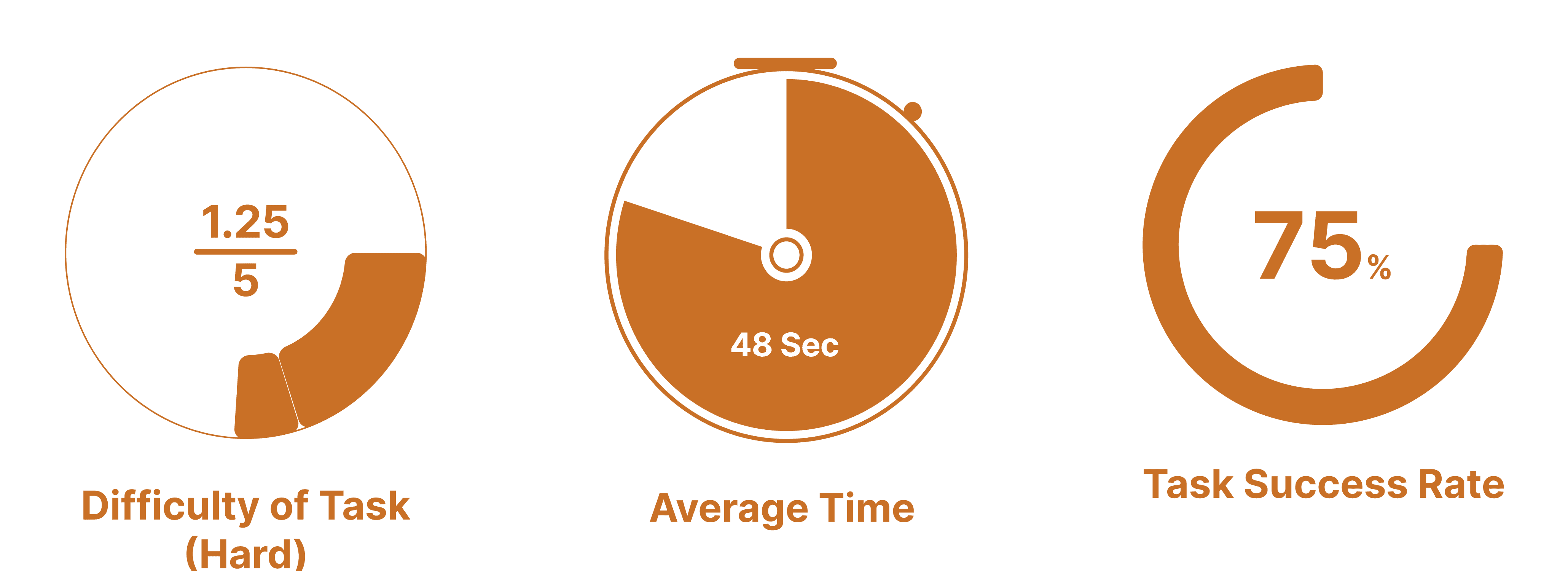
We created this storyboard which appears to outline the process of signing up to the app to trying the costume using the AR feature and then ordering the costume.
Task Analysis
We created this storyboard which appears to outline the process of signing up to the app to trying the costume using the AR feature and then ordering the costume.
SUS Analysis
We created this storyboard which appears to outline the process of signing up to the app to trying the costume using the AR feature and then ordering the costume.
Design Recommendations
We created this storyboard which appears to outline the process of signing up to the app to trying the costume using the AR feature and then ordering the costume.
Condensed Text
Prioritizing the most important functions students need and delete repeated and dead links to avoid overcrowding.
Recommendation would be to replace the light grey dots with a larger bright orange toggle. To make it more obvious to users at first glance.
Adding icons, quick search and user history to easily navigate through the home page.
Hamburger Menu
All participants required hints to navigate to the UT Map due to the unclear design, leading to an unawareness of additional functions in the hamburger menu. Most participants believe there is nothing after “Academics” as it cuts off. The redesign should include a way to let users know there is more to the hamburger menu.
Concealing detailed information within expandable tabs to enhance clarity and organization.
Add a close button in hamburger menu to align with user control and freedom, and to structure the navigation more intuitively.
Avoid horizontal scrolling in mobile version
Many users encounter challenges when switching between a horizontal navigation bar, finding it counter intuitive. We can address this issue by:
Creating drop down menu or organizing all information on a single page to eliminate the need for scrolling.
Integrating the switching page information into a unified vertical homepage.
Ensure Consistency
Uniformity in how devices display information can enhance clarity and user experience.
Reduce redundant process
The broken links, repetitive information and re-login process failed to help users find information on MyUT website efficiently. It is imperative to prioritize user convenience and streamline the browsing experience to save their time.
Takeaways
We created this storyboard which appears to outline the process of signing up to the app to trying the costume using the AR feature and then ordering the costume.
Double-check the layout promptly
During testing, some participants failed to complete the task due to different layout on the screen and unknown system error.
We should double check whether it is a system problem immediately after the testing.
Be flexible to the unexpected result
Results don't always align with our initial expectations, and it's crucial to recognize that participants may not follow the same path to complete tasks.
This in turn informs us just how complex the user experience can vary from person to person.
Don’t split the tasks into many steps
It is important to make the task easy to understand. In Task 4, the question is lengthy, making it difficult for some participants to grasp.
We learned to simplify the task to be achievable in a single action, avoiding multiple steps.